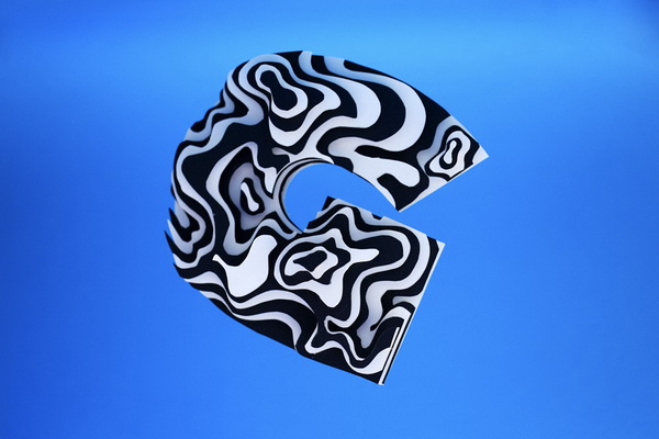
Space typography est un projet personnel de Jérôme Corgier, en vue d'explorer les formes typographiques.
Il s'agit de l'acte 1 de la décomposition de la lettre, avec pour objectif de redonner sens et vie à chacune d'entre elles. Sur cette série, je travaille particulièrement sur les couches des lettres, leur peau.
J'extrais la lettre, qui n'est plus qu'un concept, de l'alphabet et tente de remettre sa signification et son utilisation à plat.
« Through Space typography, I would like to give life to letters; then I worked inside each type with forms, movements, and eventually colors.
It helps me to feel how is construct a letter and how it can be use as "creative typography". I work the letter in 3D, mostly with paper, because I'm becoming more and more a sculptor and working with materials (not only paper). The paper is very easy to manipulate (to cut, to fold, using different colors). This for me a real emotion.
For space typography, I didn't anticipate forms; the experience determined what I did, it's really "researches" : I'm testing, testing, and when I feel its the good way, then I do. When sculpting type, I use my graphic-education in another way than usually, and I don't use it as a graphic designer. It's not only rational (serif or without serif, which type, contrast), it's visual sensation. »
April 2011 (Jérôme Corgier)

